


Key Takeaways
-
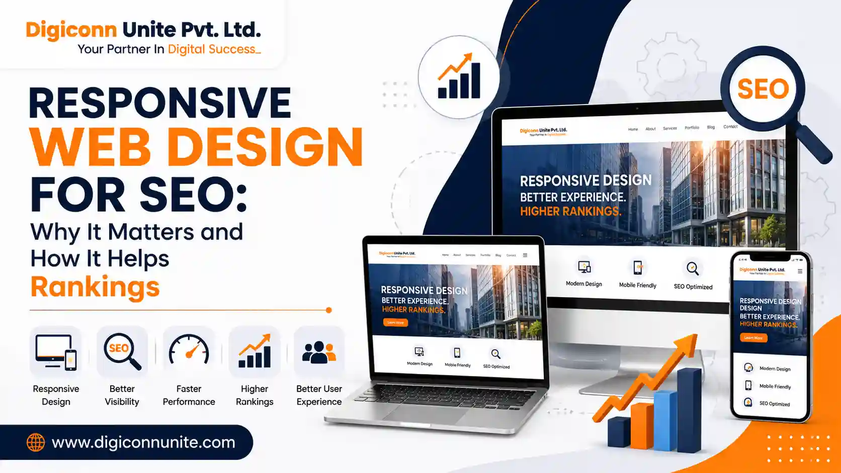
Responsive web design for SEO means creating a website that automatically adapts to mobile phones, tablets, laptops, and desktop screens.
-
A responsive website improves usability by making content, navigation, images, and buttons easier to use on different devices.
-
Responsive design supports SEO by helping search engines access and understand one consistent version of your content across devices.
-
Mobile usability, page experience, loading performance, and clear site structure can all affect how effectively users and search engines interact with your website.
-
Responsive design alone does not guarantee higher rankings, but poor mobile usability can create problems that reduce your website's overall performance.
What Is Responsive Web Design for SEO?
Responsive web design for SEO is the practice of designing and developing a website so that its layout automatically adjusts to different screen sizes while maintaining good usability, accessibility, and search engine crawlability.
For example, a website may display a three-column layout on a desktop. On a mobile phone, the same content can automatically change into a single-column layout that is easier to read and navigate.
The goal is not to create separate websites for desktop and mobile users. Instead, responsive design allows one website and its content to adapt to the visitor's device.
This is important because users may discover your business through a smartphone, continue their research on a laptop, and return later from another device. The experience should remain clear and consistent throughout.
For a more detailed explanation of the marketing side of responsive websites, you can also read What Is Responsive Web Design in the Context of Digital Marketing.
Why Does Responsive Web Design Matter for SEO?
Search engine optimisation is not only about adding keywords to a page. Search engines aim to provide users with useful and accessible results.
If a page is difficult to use on a mobile device, visitors may struggle to read the content, click buttons, complete forms, or find important information.
A responsive website helps address these problems by providing a consistent experience across different screen sizes.
Better Mobile User Experience
Mobile users should not need to zoom in to read text or scroll sideways to view content.
A responsive layout adjusts elements such as:
-
Text size
-
Images
-
Navigation menus
-
Buttons
-
Forms
-
Content width
-
Spacing
When visitors can use a website comfortably, they are more likely to explore its pages and complete important actions.
One Consistent Website Structure
Responsive design generally allows businesses to maintain one main version of their website rather than managing separate desktop and mobile pages.
This can make website management easier and help ensure that users and search engines access consistent content.
For example, instead of maintaining different URLs for desktop and mobile users, a responsive site can use the same page while changing the layout according to the screen size.
How Does Responsive Design Improve Website Performance?
Responsive design can contribute to better website performance when it is implemented properly.
However, it is important to understand that responsive design and website speed are not the same thing.
A website can be responsive but still slow if it uses oversized images, unnecessary scripts, heavy animations, or poorly optimised code.
For better performance, responsive websites should also focus on:
-
Image optimisation
-
Efficient CSS and JavaScript
-
Fast hosting
-
Reduced unnecessary code
-
Proper caching
-
Mobile-friendly media
-
Optimised fonts
The objective is to create a website that is both adaptable and efficient.
What Are the Most Important Responsive Web Design Elements?
Mobile-Friendly Navigation
Navigation should remain simple on smaller screens.
Large desktop menus may need to change into a mobile-friendly menu. Important pages should still be easy to access without overwhelming the user.
Readable Content
Text should be comfortable to read without zooming.
Long paragraphs can also become difficult to read on small screens, so clear headings, short paragraphs, and proper spacing are useful.
Responsive Images
Images should fit different screen sizes without overflowing or breaking the layout.
They should also be compressed and appropriately sized to avoid unnecessary loading delays.
Touch-Friendly Buttons
Buttons and links should be large enough and spaced properly so that mobile users can tap them easily.
Small or closely placed buttons can create a frustrating experience.
Flexible Page Layouts
Columns, cards, tables, and other design elements should adapt according to available screen space.
A layout that looks good on a large monitor may require a completely different arrangement on a smartphone.
Does Responsive Web Design Directly Improve Google Rankings?
Responsive design should not be viewed as a shortcut to the first position on Google.
Simply making a website responsive does not automatically make it rank above competitors.
However, responsive design supports several important areas of website quality, including:
-
Mobile usability
-
Content accessibility
-
User experience
-
Consistent page structure
-
Easier website management
SEO results still depend on many factors, including content quality, search intent, technical SEO, internal linking, relevance, authority, and competition.
The correct approach is to treat responsive design as an essential part of a technically sound website rather than a standalone ranking trick.
What Is the Difference Between Responsive and Mobile-Friendly Design?
These terms are often used together, but they are not exactly the same.
A mobile-friendly website is designed to work reasonably well on mobile devices.
A responsive website actively adjusts its layout based on the screen size and device.
For example, a fixed-width website may technically work on a phone but still require users to zoom and scroll horizontally. A properly responsive website rearranges its content to fit the available space.
Responsive design usually provides a more flexible solution because it supports a wider range of screen sizes.
Common Responsive Web Design Mistakes That Can Affect SEO
A responsive website can still have serious problems if it is poorly implemented.
Hiding Important Content on Mobile
Desktop and mobile users should have access to important content and functionality.
Removing valuable information from mobile pages can create a weaker experience for mobile visitors.
Using Large, Unoptimised Images
Large images can significantly slow down mobile pages, especially for users with slower internet connections.
Ignoring Mobile Forms
A form that works perfectly on a desktop may be difficult to complete on a phone.
Input fields, dropdowns, buttons, and error messages should all be tested on mobile devices.
Using Intrusive Pop-Ups
Large pop-ups can cover important content and make navigation difficult, particularly on smaller screens.
Testing Only on One Device
A website should be checked across different screen sizes and browsers. What works on one phone may not work correctly on another.
How Can Businesses Check Whether Their Website Is Responsive?
A simple first step is to open the website on different devices.
Check whether:
-
Text is readable
-
Images fit correctly
-
Navigation works properly
-
Buttons are easy to tap
-
Forms are usable
-
Content does not overflow horizontally
-
Pages load efficiently
Browser developer tools can also help test different screen sizes during the design and development process.
Regular testing is useful because new content, plugins, scripts, or design changes can create mobile issues later.
Why Is Responsive Design Important for Business Websites?
Your website may be the first place where a potential customer interacts with your business.
If that person cannot easily find your services, read your content, or submit an enquiry from their phone, you may lose a potential customer.
Responsive web design helps businesses provide a consistent digital experience across devices.
It can support:
-
Better usability
-
Improved engagement
-
Easier lead generation
-
Stronger brand presentation
-
Better accessibility
-
More consistent website management
A website should be designed around how real people use it rather than how it looks on one specific screen.
As Digiconn Unite, a web design company, our approach is to focus on responsive layouts, practical navigation, readable content, and website structures that support both users and long-term SEO goals.
Final Answer: Is Responsive Web Design Important for SEO?
Yes. Responsive web design is important for SEO because it helps create a website that is usable, accessible, and consistent across mobile and desktop devices.
It does not guarantee higher rankings on its own. However, a poor mobile experience can create usability and technical problems that affect how visitors interact with your website.
The best approach is to combine responsive design with:
-
Helpful, people-first content
-
Fast page performance
-
Clear website architecture
-
Proper technical SEO
-
Easy navigation
-
Accessible design
-
Relevant internal linking
When these elements work together, your website is better prepared to serve users regardless of the device they use.
Frequently Asked Questions
Is responsive web design necessary for SEO?
Responsive design is an important part of modern SEO because websites need to work effectively across different screen sizes. It supports mobile usability and helps maintain a consistent experience for users.
Does a responsive website automatically rank higher?
No. Responsive design alone does not guarantee higher rankings. Rankings depend on multiple factors, including content relevance, technical quality, authority, search intent, and competition.
What is responsive design in simple words?
Responsive design means a website automatically adjusts its layout, images, text, and navigation to fit the screen of the device being used.
Can a website be responsive but still slow?
Yes. Responsiveness controls how a layout adapts to different screens, while speed depends on factors such as images, code, scripts, hosting, and caching.
What should be checked in a responsive website?
Check text readability, navigation, buttons, images, forms, page speed, horizontal scrolling, and overall usability across different devices and screen sizes.
Related Topics
Explore more about web development:
