


Digiconn Unite Logo

Digiconn Unite: Building Your Digital Success.

Get a Quote
Digiconn Unite logo mark Digiconn Unite
Web Development

What is Responsive Design in Web Development?

What is Responsive Design in Web Development?
Digiconn Unite Team July 16, 2026 7 min read 49 views

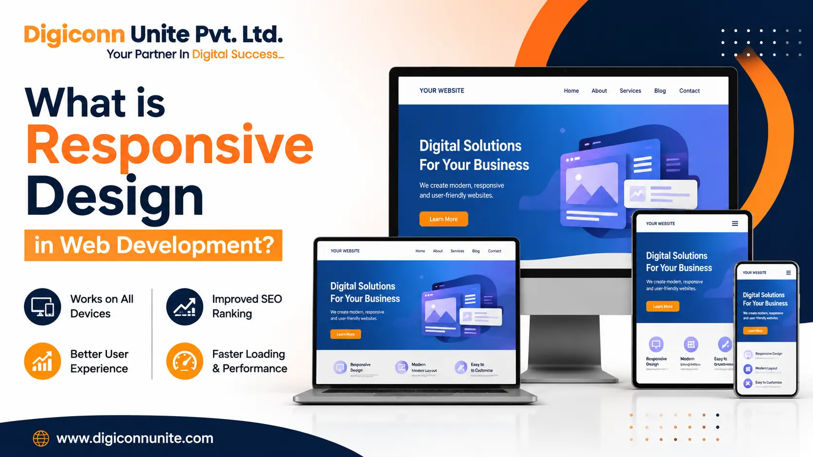
Responsive design in web development is a method of building websites that automatically adjust their layout, images, and content to fit different screen sizes and devices. Whether someone visits your website using a mobile phone, tablet, laptop, or desktop computer, a responsive website provides a smooth and user-friendly experience without requiring users to zoom in or scroll sideways.

In simple words, responsive design means one website that works perfectly on every device.

Quick Answere

A responsive website uses flexible layouts, scalable images, and CSS media queries to automatically adapt to different screen sizes and resolutions. This ensures that visitors can easily read content, click buttons, and navigate pages regardless of the device they are using.

Why Responsive Design Is Important

Today, most internet users browse websites on smartphones. Google also uses mobile-first indexing, which means it primarily checks the mobile version of a website when deciding search rankings.

If your website does not work properly on mobile devices, you may experience:

  • Higher bounce rates
  • Lower search rankings
  • Poor user experience
  • Fewer enquiries and sales
  • Reduced customer trust

A responsive website solves these problems by creating a consistent experience across all devices.

How Responsive Design Works

Responsive web design uses three main technologies:

1. Flexible Grid Layouts

Instead of fixed-width pages, responsive websites use flexible grids that resize according to the screen size.

For example:

  • A three-column desktop layout may become a single-column layout on mobile devices.
  • Images and text automatically adjust to fit smaller screens.

2. Responsive Images

Images are resized automatically to prevent them from overflowing outside the screen.

Benefits include:

  • Faster loading speed
  • Better mobile experience
  • Reduced data usage

3. CSS Media Queries

Media queries allow websites to apply different styles depending on the device size.

For example:

  • Smaller fonts for mobile screens
  • Larger buttons for touch devices
  • Different menu layouts for tablets and smartphones

This ensures every user receives the best possible experience.

You May Like Also: What Is Responsive Web Design in the Context of Digital Marketing

Key Features of Responsive Web Design

A responsive website usually includes:

  • Mobile-friendly navigation
  • Flexible layouts
  • Scalable images
  • Readable text without zooming
  • Touch-friendly buttons
  • Fast loading speed
  • Optimised spacing and margins

These features improve usability and engagement.

Benefits of Responsive Design

Better User Experience

Visitors can browse your website comfortably on any device.

Improved Google Rankings

Google recommends responsive design because it improves mobile usability and page experience.

Increased Conversion Rates

Users are more likely to contact your business or make a purchase if the website is easy to use.

Lower Maintenance Costs

Instead of managing separate desktop and mobile websites, businesses only maintain one responsive website.

Faster Website Performance

Responsive websites are usually optimised for speed, improving both SEO and user satisfaction.

Examples of Responsive Design

A responsive website may behave differently depending on the device:

Device Website Behaviour
Desktop Full-width menu and multiple columns
Tablet Reduced columns and simplified layout
Mobile Single-column layout with larger buttons

This flexibility makes websites easier to use across all devices.

Common Responsive Design Elements

Modern responsive websites often include:

  • Hamburger menus
  • Flexible image galleries
  • Responsive forms
  • Dynamic typography
  • Adaptive navigation bars
  • Mobile-friendly contact buttons

These elements improve accessibility and usability.

Responsive Design vs Mobile Website

Many people confuse responsive websites with separate mobile websites.

Responsive Website

  • One website for all devices.
  • Easier maintenance.
  • Better SEO performance.

Separate Mobile Website

  • Different versions for desktop and mobile.
  • Higher maintenance costs.
  • More technical management.

Today, responsive design is considered the industry standard.

Does Responsive Design Affect SEO?

Yes, responsive design directly affects SEO performance.

Google considers mobile usability as an important ranking factor.

Responsive websites often achieve:

  • Better search visibility
  • Lower bounce rates
  • Higher engagement
  • Longer session durations
  • Improved page experience scores

These factors contribute to better rankings in Google search results.

Best Practices for Responsive Web Development

To create a responsive website, developers should:

  • Use flexible layouts.
  • Optimise images.
  • Test across devices.
  • Improve loading speed.
  • Use readable font sizes.
  • Create touch-friendly buttons.
  • Avoid horizontal scrolling.

Following these practices ensures a smooth experience for all users.

The Future of Responsive Design

As foldable phones, smart TVs, tablets, and wearable devices continue to grow, responsive design is becoming even more important.

Modern websites must adapt not only to different screen sizes but also to changing user behaviours and technologies.

Businesses that invest in responsive web development today will be better prepared for future digital trends.

Why Businesses Should Prioritise Responsive Websites

A website is often the first impression customers have of your business. If visitors struggle to use your website on mobile devices, they may leave and choose a competitor instead.

A responsive website helps businesses:

  • Build trust
  • Improve customer experience
  • Increase enquiries
  • Generate more leads
  • Improve online visibility

For businesses looking for the best web development company in Agra, choosing a team that understands responsive web design is essential for long-term online success.

At Digiconn Unite, we build modern, responsive, and SEO-friendly websites that deliver excellent performance across all devices while supporting business growth and search engine visibility.

Related Topics

Explore more about web development:

Digiconn Unite Team
Digiconn Unite Team

Expert digital marketing professionals with years of experience helping businesses grow their online presence.